When working with responsive design, there is often a need to use the same breakpoints in both CSS and JavaScript. Keeping breakpoints separately in JavaScript and CSS is far from the best approach. The reason is that it leads to duplication: breakpoints are defined in both CSS and JS, creating two entry points. If breakpoints are changed in one place (for example, in CSS), they may be forgotten to update in another place (JavaScript).
To avoid such risks, we will utilize a single entry point where breakpoints are defined in one place in CSS (SCSS) styles and then passed to JavaScript as an object.
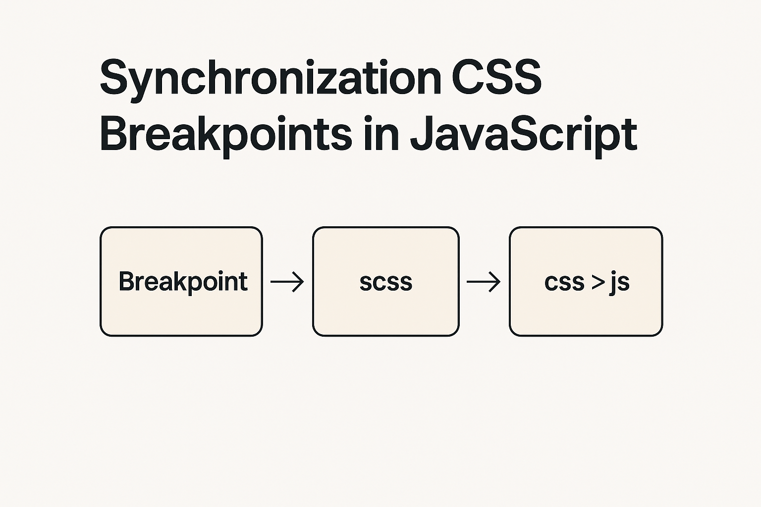
Defining Breakpoints in SCSS
In SCSS, we create a map of breakpoints. The map in CSS is similar to an associative array in JavaScript, in simple terms, it’s an object with keys and values.
$grid-breakpoints: (
	xs: 0,
	sm: 576px,
	md: 768px,
	lg: 992px,
	xl: 1200px,
	xxl: 1400px
);
Passing Breakpoints to CSS via Pseudo-Element
To transfer the data to JS, we will use ::before and embed the breakpoint string in content.
But first, we need to convert the map into a string. For this, we will write an SCSS function to convert the map.
@function map-to-string($map) {
	$result: "";
	@each $key, $value in $map {
		$result: "#{$result}#{$key}: #{$value}, ";
	}
	@return $result;
}
We then apply it to body::before:
body {
	&::before {
		content: map-to-string($grid-breakpoints);
		display: none;
	}
}
Extracting the String from CSS to JavaScript
In JS, we can get the value of content from the pseudo-element ::before using the js method getComputedStyle and assign it to a variable.
const rawBreakpoints = getComputedStyle(document.body, '::before').getPropertyValue('content').replace(/\"/g, '').trim();Converting the Breakpoint String to an Object
To interact conveniently with our breakpoints in JS, we need to convert the string into an object. We parse the string and turn it into an object:
const breakpointsArray = rawBreakpoints.split(', ').map(item => item.split(': '));
const breakpointsObject = Object.fromEntries(breakpointsArray);
Now the variable breakpointsObject contains an object with all the breakpoints from SCSS:
console.log(breakpointsObject); // { xs: "0", sm: "576px", md: "768px", lg: "992px", xl: "1200px", xxl: "1400px" }Using matchMedia to Track If the Screen Width Matches Our Breakpoints
We use the matchMedia property and pass in the required breakpoints from the breakpointsObject.
We monitor changes in the media query: when the screen width starts matching a certain breakpoint, a callback function with the necessary JavaScript logic for that specific breakpoint is triggered.
In our example, this logic is contained in the function handleMinLg. This function is applied when the media query matches the value recorded in breakpointsObject.lg. In this case, it’s a minimum width of 992px.
const breakpointMinLg = window.matchMedia(`(min-width: ${breakpointsObject.lg})`);

handleMinLg(breakpointMinLg); // executes on initial page load
breakpointMinLg.addEventListener('change', handleMinLg);

function handleMinLg(e) {
	// if true is returned, it means the screen width matches the specified media query
    if (e.matches) {
		console.log('Screen width is greater than or equal to 992px');
    }
}
In Summary
With this approach:
- We avoid duplicating breakpoints between CSS and JavaScript;
- Maintenance becomes simpler and safer;
- We have a single entry point for breakpoints that are used in both CSS and JavaScript.
This is a clean and sustainable solution for synchronizing responsive points between CSS and JavaScript.